
Why Color Matters in a Tiny Home
In a small home, every design choice has a visible impact. Color is one of the most powerful tools available because it shapes how a room feels, how light moves through it, and how spacious it appears. The right cozy color palette can make a tiny home feel open, airy, and inviting at the same time. That balance matters. You want a space that looks brighter and larger, but also warm enough to feel like home.
When people search for tiny home decorating ideas or small space color schemes, they are often looking for simple changes with a big visual effect. Paint, textiles, cabinetry, and accent decor all contribute to the overall atmosphere. In a compact layout, soft neutrals, reflective finishes, and carefully chosen accents can help reduce visual clutter and create a more restful environment. The best palettes support natural light instead of competing with it.
Soft White and Warm Beige for an Airy Small Space
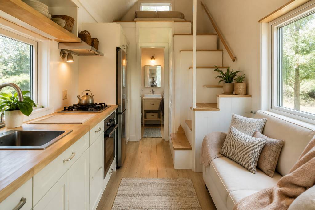
Soft white remains one of the most effective choices for a tiny home interior. It reflects natural light well and creates a clean backdrop that makes walls seem farther away. When paired with warm beige, the look becomes more comforting and less stark. This combination works especially well in open-plan layouts where the kitchen, living area, and dining space share the same visual field.
A warm white wall color can be complemented by beige upholstery, light oak furniture, and woven textures. The result is calm and cohesive. If you want the space to feel cozy without feeling crowded, use layered materials such as linen curtains, rattan baskets, and natural fiber rugs. These details add softness while keeping the palette light.
- Use warm white on walls and ceilings to maximize brightness
- Choose beige or sand-toned textiles for a soft contrast
- Add wood tones in light finishes to maintain an open look
Greige Tones for a Balanced Tiny Home Color Scheme
Greige, a blend of gray and beige, offers one of the most versatile small space color schemes. It feels more modern than beige alone, but warmer and more approachable than cool gray. This is an excellent option for homeowners who want a neutral palette with depth. Greige pairs well with almost any accent color, from sage green to muted blue.
In a tiny home, greige can be used on walls, kitchen cabinets, or built-in shelving. It creates continuity without becoming visually heavy. Because it is neither too warm nor too cool, it works across different lighting conditions. That makes it a smart choice for compact interiors that receive limited daylight.
Pale Sage Green for a Calm and Spacious Feeling
Pale sage green is a popular color for small home interiors because it brings a natural, restorative quality into the space. It has enough color to feel intentional, but it remains soft enough to preserve brightness. This shade works particularly well in bedrooms, bathrooms, and reading corners where a sense of calm is important.
When used on cabinetry or as an accent wall, sage green can make a tiny home feel more connected to the outdoors. It pairs beautifully with white trim, light wood, and brass hardware. The palette feels fresh and grounded at the same time. For a more layered look, combine sage with cream-colored bedding, textured ceramic accessories, and plants in simple planters.
- Paint one focal wall in pale sage for subtle depth
- Mix with off-white and light oak for a natural finish
- Use greenery to reinforce the organic color story
Dusty Blue and White for a Brighter Compact Interior
Blue is often associated with openness, and in a tiny home, a dusty blue palette can create a fresh, breezy atmosphere. The key is choosing a softened version rather than a saturated tone. Dusty blue paired with white gives the interior a brighter appearance while maintaining a soothing, lived-in feel.
This palette is especially effective in spaces with limited square footage because it introduces color without overpowering the room. It works well in coastal-inspired interiors, but it can also feel refined in a modern setting. Consider dusty blue for lower cabinets, a sofa, or decorative storage pieces. Keep the rest of the palette light so the room continues to feel expansive.
Soft Taupe and Cream for a Cozy Neutral Layer
Soft taupe is a warm neutral that adds depth while still supporting a small room’s sense of openness. Combined with cream, it creates a layered palette that feels inviting and polished. This is a strong choice for tiny home living rooms or multipurpose spaces where comfort and visual ease are equally important.
Unlike darker browns, taupe offers richness without making walls feel closed in. It works well in matte finishes, upholstered furniture, and soft furnishings. Cream can then be used for curtains, bedding, and ceiling treatments to keep the eye moving upward. The contrast is subtle, which is exactly what many compact interiors need.
Butter Yellow Accents for a Cheerful Small Home Design
If your goal is to make a tiny home feel brighter, butter yellow can be an effective accent color. It brings warmth and a gentle sense of optimism, especially when used in small doses. In compact rooms, bright yellow can feel overwhelming, but a muted buttery version adds light and charm without dominating the space.
Butter yellow works best as an accent in cushions, tableware, artwork, or a painted niche. It pairs beautifully with white walls, pale wood, and soft gray textiles. The color helps sunlight feel even more abundant, which can be especially useful in rooms that face north or receive limited natural light. Used thoughtfully, it can lift the entire mood of the home.
Light Gray and Soft Blush for a Contemporary Cozy Look
Light gray remains a classic small home color because it provides a clean, understated backdrop. When paired with soft blush, it gains warmth and personality. This palette feels contemporary and welcoming, making it a strong option for homeowners who want a subtle decorative edge without sacrificing brightness.
Blush is particularly effective in textiles and artwork, where it adds a gentle contrast to gray walls or furniture. Keep the overall tone light and airy by using metallic details in brushed nickel or matte brass. The combination feels polished but never cold. It is also easy to update over time by swapping out accessories.
Warm Terracotta with Cream to Add Depth Without Darkening the Room
Terracotta is often thought of as a bold, earthy color, but in its softer forms it can be an excellent choice for tiny home decorating. A muted terracotta wall, cushion, or ceramic accent introduces warmth and character while still feeling natural. When balanced with cream, the palette becomes cozy rather than heavy.
This combination is ideal for people who want a more grounded interior that still feels bright. Cream prevents terracotta from becoming too intense, while the earthy tone keeps the room from looking sterile. Use this palette in kitchens, dining nooks, or entry areas where a welcoming atmosphere matters most. Terracotta also pairs well with handmade textures and natural materials.
Powder Blue and Pale Wood for a Fresh Tiny House Interior
Powder blue can make a tiny home feel open and serene. It reflects a sense of freshness, especially when combined with pale wood finishes. This palette works well in bedrooms and bathrooms, where lightness and relaxation are priorities. It also suits Scandinavian-inspired interiors that focus on simplicity and function.
Pale wood prevents the color scheme from feeling too cool. Instead, it adds warmth and texture. Think light ash, birch, or whitewashed oak. Together, powder blue and pale wood create a space that feels uncluttered and breathable. The effect is gentle, which makes it ideal for compact rooms that need visual calm.
Muted Olive and Ivory for an Organic, Spacious Palette
Muted olive green offers a more earthy take on the cozy color palette trend. It feels sophisticated and grounded, but when softened enough, it can still help a tiny home appear bright and balanced. Ivory is the perfect partner because it keeps the room from feeling too dense. The contrast is subtle, yet the atmosphere becomes noticeably richer.
This palette works beautifully with natural textures such as jute, linen, and unfinished wood. It is also effective in small kitchens and dining spaces where you want warmth without visual heaviness. Olive can be introduced through cabinetry, throw pillows, or a feature wall, while ivory keeps the overall feel open and light.
- Choose muted olive rather than deep forest green
- Pair with ivory walls, curtains, or rugs
- Use matte finishes to keep the palette soft and modern
Sand and Sea Glass for a Coastal Small Space Color Story
Sand and sea glass create one of the most naturally bright tiny home palettes. The combination suggests a relaxed coastal feel without becoming overly themed. Sand tones provide warmth and stability, while sea glass shades introduce freshness and a subtle touch of color. Together, they make a room feel light, breathable, and easy to live in.
This is a particularly good option if your tiny home has large windows or outdoor views, because the palette complements natural light beautifully. Use sand in flooring, sofas, or woven accessories, and introduce sea glass through decorative objects, bathroom tiles, or cabinet details. The effect is soft and spacious, with a calm rhythm that suits small interiors well.
Choosing the Best Cozy Color Palette for Your Tiny Home
The best cozy color palette for a tiny home depends on how you use the space, how much natural light it gets, and the mood you want to create. If brightness is the priority, soft whites, pale blues, and cream-based combinations are reliable choices. If you want more depth, greige, taupe, sage, and terracotta can add character while still protecting the sense of openness.
In most tiny home interiors, the most successful approach is to keep the main surfaces light and introduce deeper tones through accents. That may mean painting walls in a warm neutral, using a muted color on cabinetry, or layering textiles in soft complementary shades. The goal is not to eliminate color, but to use it strategically. With the right palette, a small home can feel bigger, brighter, and more comfortable every day.