
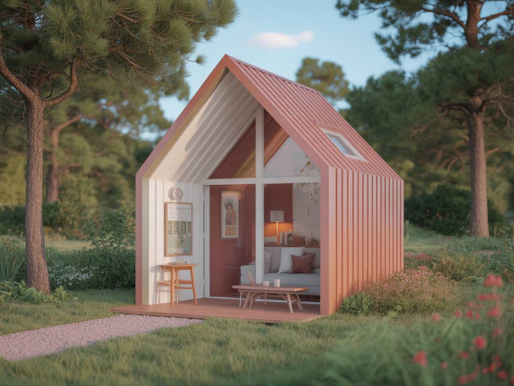
Choosing the right paint colors is one of the most powerful strategies to visually enlarge a tiny house while keeping it warm, cozy and inviting. In a mini home, every surface matters. Walls, ceilings, floors, trims and even furniture finishes contribute to the perceived volume of the space and the overall atmosphere. With thoughtful color choices and a few optical tricks, it is possible to create a brighter, larger-looking interior without sacrificing the intimate feel that makes small houses so appealing.
How Color Affects Space Perception in a Tiny House
Color is much more than a decorative choice. It directly influences the way our eyes and brain interpret the size of a room and the level of comfort it provides. In a compact living area, the right color palette can make ceilings seem higher, walls appear farther apart and circulation feel more fluid.
Light colors tend to reflect more light, making a room feel airy and spacious. Darker shades, in contrast, absorb light and visually bring surfaces closer, which can make a small room feel cramped if used in large quantities. However, rich and deep colors can also be used strategically to add depth, character and warmth when applied in the right places.
For a mini house interior that looks larger and feels welcoming, the key is to balance brightness and warmth. Neutral bases, soft contrasts and carefully placed accents usually work better than very strong oppositions or overly busy schemes.
The Best Light Colors to Visually Enlarge a Mini House
To visually enlarge a tiny space, designers often recommend light shades with warm undertones rather than pure bright whites. Extremely cold whites can make a room look sterile and unforgiving, while warm, creamy neutrals create a softer, more flattering light.
Some of the most effective light colors for tiny houses include:
These tones help bounce natural and artificial light around the room, stretching visual boundaries. They also provide a calm backdrop for furniture, textiles and decorative objects. Because they are discreet, they do not visually clutter the space.
In a tiny house, using the same light neutral on multiple surfaces can blur the boundaries of the room. When walls, trims and even doors share a similar tone, the eye does not stop at harsh junctions and the room feels larger. This technique is particularly useful in small corridors, compact living rooms and narrow bedrooms.
Adding Warmth with Accent Colors in Small Spaces
While light neutrals are ideal for enlarging a mini house, they can sometimes create a flat atmosphere if used alone. To add personality and warmth without shrinking the space, accent colors should be introduced thoughtfully. The objective is to create a warm atmosphere with color, texture and contrast, but without overwhelming the limited surface area.
Warm accent colors that work well with light bases include:
These colors evoke natural materials such as clay, stone, wood and foliage. When used in textiles (throws, cushions, rugs), small pieces of furniture, decorative pottery or artwork, they help create a welcoming and comforting mood. They are particularly effective in tiny living rooms and dining corners, where the goal is to encourage relaxation and conviviality.
In very small interiors, it is wiser to limit the number of accent shades. Two to three complementary colors, repeated in different rooms, are usually enough to bring coherence to the overall decor. This visual continuity also helps the tiny house feel like a single, flowing space instead of a series of cramped areas.
Using Dark Colors Strategically to Add Depth and Coziness
Dark colors may seem risky in a mini house, yet when applied in a controlled way, they can actually enhance the feeling of depth and create a cocoon-like atmosphere. The key is to use them selectively and balance them with plenty of lighter tones.
Several strategies are particularly effective:
Deep greens, smoky blues with a hint of grey, chocolate browns, charcoal and aubergine can all work well. To avoid making the room feel heavy, combine these shades with warm light neutrals, plenty of natural textures (wood, rattan, linen, wool) and good lighting.
Color Zoning to Organize a Tiny House Layout
In a small home, different functions often share the same open space: kitchen, dining, living and sometimes a home office. Color zoning is an intelligent way to visually separate these areas without adding actual walls, which would make the space feel smaller and block natural light.
Color zoning can be achieved through:
The secret is to keep a consistent base color throughout the tiny house, especially on walls and ceilings, then vary the secondary and accent colors to define each function. This method maintains a sense of unity while structuring the space visually. It also helps guide the eye and circulation, which contributes to the perception of a larger, organized mini home.
Choosing the Right White and Neutral Tones for a Warm Atmosphere
Not all whites and neutrals are equal when the goal is to enlarge a room and create a warm atmosphere. The undertone of the paint plays a crucial role. Cool undertones (blue, green) tend to make the space look crisp but sometimes cold. Warm undertones (yellow, red, pink) bring softness and a cozy feel.
For tiny houses, warm whites and neutrals are generally more forgiving and inviting. They flatter skin tones, enhance the natural color of wood and textiles, and pair well with earthy accents. When choosing paint, it is important to test samples on different walls and observe them at various times of day, as natural light can significantly change their appearance.
In north-facing or shaded rooms, colors often appear cooler and darker. In such spaces, ivory, light beige and creamy greige help compensate for the lack of warm sunlight. In south-facing, very bright rooms, slightly more muted or greyed neutrals can prevent the room from feeling too glaring while still reflecting light efficiently.
Coordinating Colors with Materials and Textures
Color is inseparable from materials and textures when designing a warm, visually enlarged mini house. Paint choices should be coordinated with the natural tones of wood floors, beams, cabinetry, textiles and decorative accessories. Harmonious combinations enhance the feeling of space and comfort; clashing tones can make the room feel visually noisy and smaller.
To build a coherent palette, it can be helpful to start from a key element that will remain for a long time: a wooden floor, a sofa, a kitchen worktop. From there, select wall colors that complement rather than compete with these materials. For example, honey or oak wood pairs beautifully with warm whites, sand tones and olive greens. Cooler woods like ash or very light pine often work better with beige-greys and soft warm greys.
Textiles also play a significant role in the overall color impression. Linen, cotton, wool and natural fibers in off-white, beige, caramel, terracotta and muted greens instantly warm up a neutral base. When surfaces are kept relatively light and simple, these tactile, colored elements stand out without crowding the space, creating a layered but serene decor.
Light, Color and the Perception of Space in a Mini House
Lighting is a crucial partner to color when trying to visually enlarge a tiny house. Even the best color choice can look flat without the right light sources. Conversely, a well-lit small interior with a coherent, warm palette can feel surprisingly generous.
To reinforce the feeling of space and comfort, consider these guidelines:
When natural light is limited, very dark walls are more difficult to manage in a tiny house. In such situations, light and warm neutrals supported by layered lighting can provide a much more comfortable environment while still feeling intimate.
Building a Cohesive Color Palette for a Tiny Home
To make a mini house feel spacious and harmonious, it is useful to build a coherent color palette that runs throughout the interior. This does not mean all rooms have to look identical, but rather that they should share a family of tones and intensities.
A practical approach for small homes is to structure the palette in three levels:
Repeating these colors, in different proportions, in each area of the mini house creates a sense of continuity. When the eye recognizes the same tones from one room to another, it perceives the home as a single, flowing space rather than a succession of compartments. This impression of unity is one of the most effective ways to visually enlarge a small interior while maintaining a warm, human scale.